Why aerial photography makes gallery walls easy
Every gallery wall needs a unifying logic: subject, format, palette, or medium. Aerial photography hands you all four at once: the same elevated perspective in every frame, naturally geometric compositions, a consistent Melbourne palette of blue, grey and gold, and one archival print medium throughout.
That's the advantage of building from a single photographic collection instead of mixing artists: the coherence is free. The remaining work, and the interesting part, is arranging the differences in subject, mood and time of day so the wall reads as a conversation, not a repeat.
Pairing cool coastal with warm urban
Melbourne's water and its city sit at opposite ends of the colour spectrum. Coastal frames (the bay, Albert Park Lake, the foreshore) run cool: blue-greens and the silver-grey of open water. Urban frames run warm to dark: first light on tower glass, the charcoal of the CBD grid.
Use that contrast; don't fight it. A cool coastal print hung next to a warm urban one makes the gold richer and the water deeper. It's the same warm/cool balancing act a well-designed room does with its furniture and finishes.
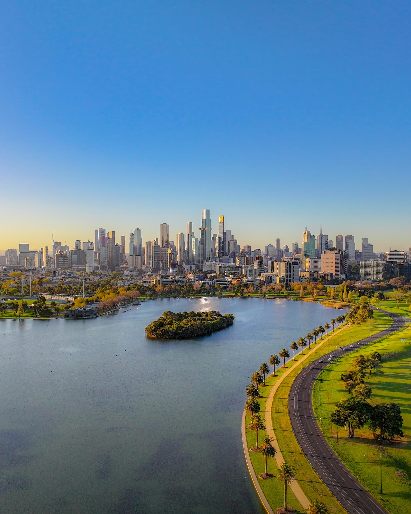
If you want a bridge between the two, the Albert Park Sunset is the collection's natural connector: cool blue-grey lake, green-gold parkland, and a skyline carrying both warm reflections and cool glass. It sits comfortably next to either extreme.
Three layouts that work
Hanging tips that save you re-drilling
Paper templates are the cheapest insurance there is. Cut paper to each framed size, blu-tack the arrangement to the wall, and live with it for a day. What looks right at 9am can look wrong under evening lamps. Only then drill.
For spacing, a 4cm square of cardboard held between frames beats a tape measure every time. And keep every frame the same finish, matte black throughout, or oak throughout. Varied prints in matching frames almost always beats the reverse; mixing frame finishes well is harder than it looks.
For frame selection and mat sizing, the framing guide goes deeper. If you're planning a wall around two or three prints from the collection, get in touch. I'm happy to advise on combinations for your space, and multi-print orders ship together.
All three prints in the collection work as a series. Multi-print orders? Just ask.
Browse the Collection